Work
Shopper Marketing
Advertising
Packaging
Digital
Collateral
Identity
Our Services
Our People
Our Clients
Contact
Careers
WORK
Show All
|
Shopper Marketing
|
Advertising
|
Packaging
|
Digital
|
Collateral
|
Identity
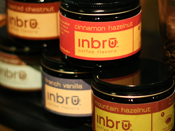
Inbru Packaging
Packaging
Schaeffer’s Packaging
Packaging
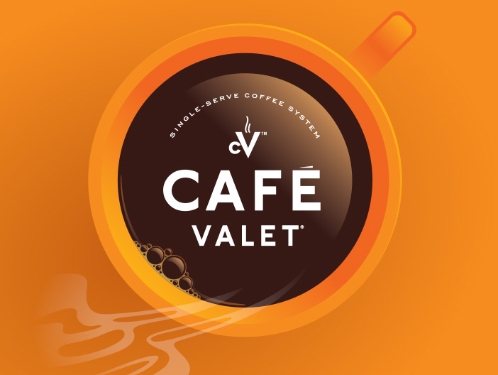
Café Valet Packaging
Packaging
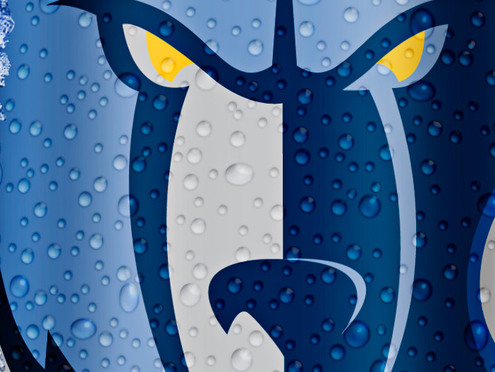
Bud Light Grizzlies Packaging
Packaging
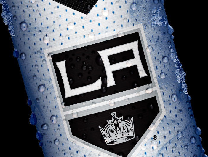
Bud Light NHL Kings Packaging
Packaging
Home
Work
Shopper Marketing
Advertising
Packaging
Digital
Collateral
Identity
Our Services
Our People
Our Clients
Contact
Careers
Let’s start a new project together!
Contact Us